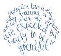
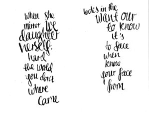
I had a fantastic tutorial with a tutor at my university, Kim. It really turned my final major project in a better direction in the visuals of the book and the layout and how it will look. She told me to be more illustrative with the book, as an illustration student she felt I wasn’t being illustrative enough especially with the type.  So I began to hand write the quotes myself. It took me a while to find the right medium to write them out and a way that made them look nice. I used fine liners and it just didn’t have a very good quality to it and it was hard for me to be creative with it. I then tried watercolour/ink with a brush and I found it hard to control the neatness of the typography, it just looked messy and not well done. I then used a fountain pen and I began to really like the quality to it and I liked the way the letters looked but I thought perhaps using a dip pen would look better, so I dug out the only dip pen I had which was a nice glass fountain pen from Florence and had a go.
 It was amazing how much the quality of it changed, it looked really nice and I enjoyed the process of using it. I really want to explore using the dip pen more with illustrations as well as typographically.
I was talking to Kim about the flow of the book and how I want it to be a continuous piece and flow as one so she suggested I use watercolour throughout the book to link the text and illustrations together as I’ve already used watercolour in the illustrations. To be honest I didn’t know why I hadn’t thought about it before.
I think what I was more worried about was how I was going to achieve this one long piece. I had a few options. I could create one long piece and illustrate then scan it all in or I could do it in pieces. I think for ease of scanning I’m choosing to do it all in bits to help organise an order and arrange the book and the different areas of watercolour.
(DISCLAIMER: Header image not mine. You can find it here)
